Welcome to my AS media coursework blog

Throughout this blog you will get the opportunity to view my progress throughout the course and see my plans, sketches, final products and everything else which contributes to my coursework.

Thursday 30 September 2010

Photographs for front cover and contents page of school magazine- Preliminary Task 29/09/10

I took a range of images with the intention to choose at a later stage which images will be on my final production. For my main image I chose to make the picture longer than a medium close up because then I would have had mroe flexibility when it came to editing my photograph. The image of the corridor is what I intent to use as the background for my magazine front cover. The rest of the images that i select to use, I will use on the contents page to link with the relevent stories. 


Medium close up

Medium shot- Which I intend to cut to size for m main image

I could use this image as the main image for my contents page

This picture will be for my story of ID Tags

This will be used for my background image

This will be used as part of my Results feature

This could be used as the image for my healthy eating feature

This could be used as the image for my story on new uniform

This image can be used for my 'Make Up Debate' article


Tuesday 28 September 2010

Preliminary Exercise-Rough layout of Contents Page 28/09/10

Below is the first sketch of my contents page. It is presented in columns with a main image and other smaller images which relate to the feature stories. The 'On the Cover' section highlights the page numbers that the feature stories are on. The Other section of the contents page; 'What Else is Inside?' leads the reader to the regular content of the magazine. This part of the contents page would be less eyecatching because I want the readers to be primarily attracted to the feature articles.As in the rough layout of my front cover colours on teh contents page are not visible althougha similar colour scheme of blues is used; as on the front cover and throughout the magazine.

Preliminary Exercise - Planning Content 28/09/10

I created a spider diagram of my ideas for regular content for my school magazine. This content is going to make the readers feel comfortable reading the magazine and I decided that this content must be very enjoyable and quite diversable -so that there is something new and interesting every week. One unusual aspect of my regular content is 'Jennys Corner'. The logic behind this article is that one student in the school writes each week about the happenings in the school. The readers can write into jenny asking questions or asking for some advice. Below is the diagram of my ideas:
I came up with ten ideas for feature stories with the intent to choose at a later stage which ones I though would be more sucessful. Below is a spider diagram of my ten initial ideas.
The ideas labelled with an asterisk are the ideas that i intend to use in my final piece. These are:
  • Exam Results
  • Make up
  • Sixth form ID Tag debate
  • New Uniform
  • Healthy eating

Finally, for the planning of my contents page I created a diagram of the pictures that I will have to take to use in my contents page. These pictures are all related to the feature stories and they will all be positioned in suitable places in my magazine contents page where they can be easily associated with the relevant stories.

Preliminary Task-Rough Layout of Front Cover

I created a rough sketch of what I would like the front cover to look like. The colour scheme for my front cover and contents page will be shades of blue. This also matches the school uniform. Colour is not seen on the sketches of my front cover although the title is two different shades of blue. The 'KOOL' inside the word 'SKOOL' is a darker shade of blue so that it stands out. The colour in the images will be subject to the colour of the corridors, the girls hair and skin tone etc. The Price of the magazine will be inside a spiked box so that it stands out. The colour of this box will be red so that it is very eyecatching. The graphology will be bold and thick and will conform with the colour scheme of the title and general magazine.

Preliminary Exercise-Plans for front cover 28/09/10

The following plans include my spider diagrams of my starting ideas for the front cover of my new school/college magazine. The title of my magazine is 'SKOOL MAG'. I chose this title because it is obvious to the reader what the magazine is for and it instantly attracts the target audience with the word 'SKOOL'. I misspelt school because it makes the magazine seem more appealing to the target audience. Eleven to eighteen year olds would not be as interested in a magazine which uses 'full english' as they would be to a magazine which uses 'slang'. This is because teenagers think that 'slang' is a lot more up to date and more fun.

The diagram below shows the steps that I am going to take when it comes to taking and producing my main image and it shows the details of the mise-en-scene that I will use:


 Below is a spider diagram of my ideas that I will use for my cover stories (Feature Articles). I thought of ten different ideas with the intention to rectify them later:


Sunday 26 September 2010

Camera Shots 24/9/10

During this lesson we learnt about different camera angles. This will be useful for when we come to take pictures to use as part of our coursework pieces. The images were only a rough guide to ensure that camera angles were fully understood. We recieved a list of pictures that we should have took and were given around twenty minutes to take them.Below are the images that we created along with the brief of the shot that we were meant to take:
Close up of Nature
Close up of the Time
Over the shoulder shot of somebody writing
Close up of someone on the phone
An image which connotes Friendship
An image which connotes stress
A low angle medium close up
Medium shot
Extreme long shot which displays isolation

Wednesday 22 September 2010

Codes and Conventions of Magazine Front Covers and Contents Pages

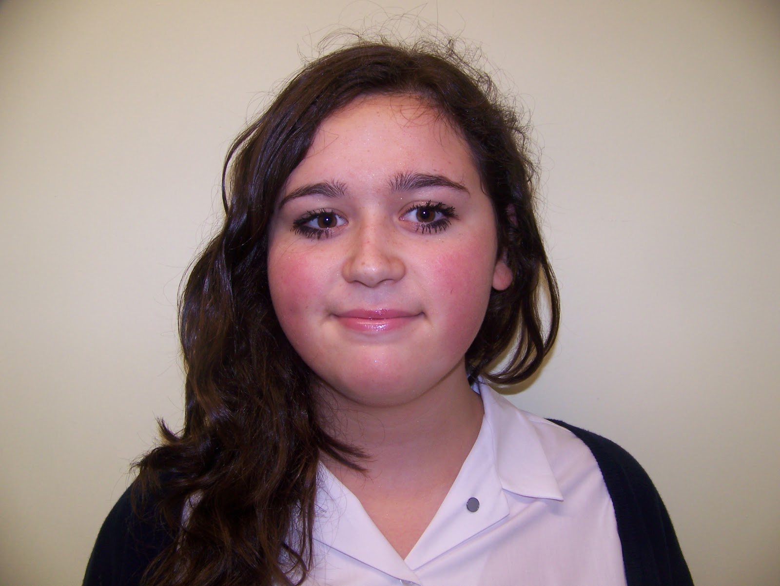
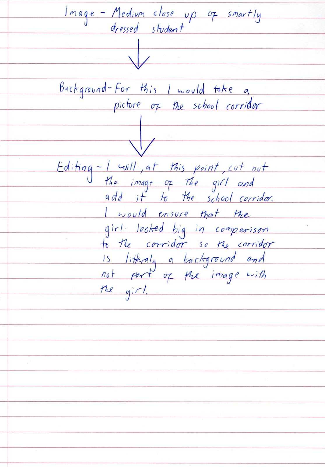
Here I have established the codes and conventions of magazine front covers, contents pages and double page spreads. To the left is an image of the popular music magazine 'Q'. All of the codes and conventions of magazines are easy to find on such a well known music magazine.
The codes and conventions of a music magaine front cover are:
  • A Masthead 
-Which is bold
-Eye catching
-Positioned at the top left hand corner of the page
-Have a unique font
-Should be the largest text on the front cover
  • A Main Image
-Usually a band or singer
-Usually is a medium close up
-The picture conveys an attitude
-Direct address – Looking at the reader


  • Main Cover line

-Anchors the meaning of the main image
-It’s the largest cover line on the page
-It is usually two lines

  • Other Cover lines

-Two or three words – Few words as possible
-Information about the contents of the magazine
-Used to tease and intrigue the audience
-Cover lines not always straight forward

  • Typography

-Consistent
-Only few font are used


  •  A positioning statement by the title
  • A Barcode- on the front because adverts feature on the back page
  • An issue number
  • An issue date
  • Bold font for most text including cover lines on the front cover
  • Buzz words-To attract the reader to the stories
  • Small print is often at the bottom of the front cover. This usually includes the producers name and other small pieces of information.
  • Colour is used to emphasise which genre the magazine is, a colour scheme is important, few colours and simple
  • Puff, something for nothing usually free for the customer e.g. Poster Book
  • Smaller images of artists
  • Sophisticated images and layout


    The codes and convention of a contents page are:

    • The use of headings divides up the contents page so it is easier to follow
    • An editorial letter with a picture
    • One large image and also smaller images (Which has page numbers clearly displayed on or around the pictures)
    • The text is presented in columns
    • There is a consistent colour scheme, which follows on from the front cover
    • Small text is used for text in the contents page ( No bigger than 11 point)
    • Subscription details
    • Social Network details E.g. Twitter and Facebook
    • A white background
    • The main image usually reflects the double page spread
    • Title of the magazine is repeated
    • The issue date on the contents page
    • Title 'Contents'
    • Page numbers, with the title of the article and sublines which are smaller text about the article
    • At the bottom corners of the page the magazine title, issue date and page numbers 
    • Creative photography

    The codes and conventions of a double page spread are:
    • Headlines- Eye catching, and largest text on the page
    • Names are picked out and highlighted, like the artists name
    • Page number, title of the magazine , issue date and often website are usually at the bottom of the page
    • Colour Scheme-Limited use of colour
    • A stand first-Introduces the article and draws the reader in-Near to the headline, before the article begins-Larger font than the rest of the article, but much smaller than the headline-Works with the headline to give a brief introduction to what the article is about
    • Pictures take up at least one page of the double page spread
    • Pictures often bleed across one page to another
    • Headline bleeds across both pages
    • Headline usually is on one line
    • Drop cap at the start of the article. They usually drop between 2-5 lines
    • More than one image should be used
    • Smaller images are used to break up the article for a more entertaining read
    • Drop quotes, attract the reader to the story, usually funny or interesting 
    • The writer usually positions their name in the standfirst or at the end of the article
    • The photographer is also mentioned at the end of the piece of next to the images
    • Laid out in columns, usually three or four per page
    • Creative photographs
    • Text in paragraphs
    • Fairly informal tone
    • The personality of both the artist and writer is shown throughout the article, including personal opinions