Sunday 2 January 2011
Evaluation
There was a problem with the publishing of my video on question five, therefore, it is not straight, this does not afftect the viewing or listening of the video, it just looks slightly unusual.
For a full screen view of my evaluation please use the link below then use the full screen button:
http://www.scrapblog.com/viewer/viewer.aspx?sbid=2898556
Audience feedback
For my audience feedback I created a questionnaire. Below is my questionnaire and also my questionnaire results and conclusions.
1.What do you think about the title of my magazine- both the colours and the name?
2. How do you feel about the images throughout my production?
3. Do you think my production would look good alongside already established magazines on the shelves of
large supermarkets?
4.What do you think about my coverlines? Do they interest you?
5. Is my contents page easy to follow?
6.Are my stories on my contents page exciting or do you feel that you would not want to read some of them?
7. How do you think I have attracted my target audience?
8.Do you think my double page spread looks exciting and interesting?
9. Do you think that the story in my double page spread is well written and suitable to the target audience or not?
10. How do you feel about the fonts that I have used in my production?
11. Do you think the editor letter sounds interesting and makes the magazine sound exciting?
13. Does the band that I have interviewed appeal to you as a reader and music fan?
14. Do you think that the magazine is worth the price that I have charged?
15. Do you think my tagline represents my magazine well?
Production of DPS
 |
| Here I previously edited my images in photoshop, the same way that I edited my pictures for my front cover image-using the lassoo tool then adding a different background. I chose to use a side angle for my image because it was original and looked appealing. The colours follow a colour scheme and suite the style of writing of my piece. I drew a black square then added the different coloured pictures into each quarter. The bottom right is for the band title. |
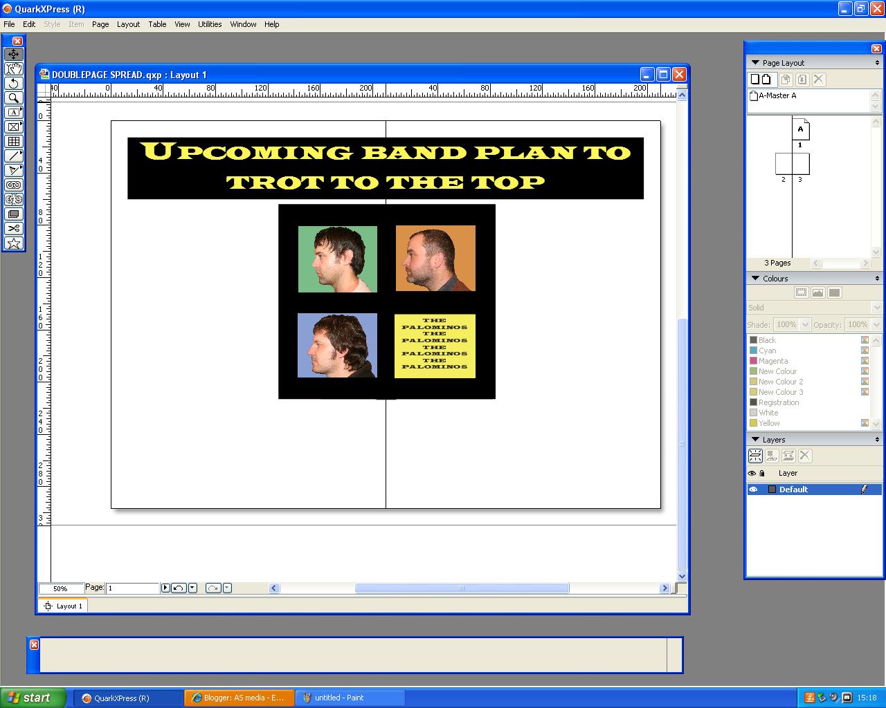 |
| Next, I added my heading. I used a black background colour and a yellow heading to suite the colour scheme. |
 |
| This is the text tool which I used to add my heading and also the band title in the bottom right hand box. |
 |
| Next I added my stand first, I made sure it was exciting to draw in my audience. I also but a yellow background so that my standfirst stood out. |
 |
| Next I imported my text by right clicking. |
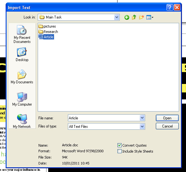 |
| Here I am selecting the text which I want to import-which is my article |
 |
| I did this so that I could word process my article to ensure there were no spelling mistakes or missing punctuation. I also added a drop cap to follow codes and conventions of double page spreads. |
 |
| I had to use the linking tool to link together my columns. This allowed my text to overflow into the next column. |
 |
| Next, I added drop quotes to my article. I had to ensure that the drop quotes were symnmetrical so that I followed codes and conventions of double page spreads. |
 |
| Here I have kept the same text but I have deleted my main image, I have also changed the font of my heading, I also took a picture which I previously added to my original double page spread to the bottom of the page. |
 |
| Here I have added a main image with a horse. This relates to the band name because a palomino is a horse and it also refers to the word 'trot' in the title. |
 |
| This is me cutting out a horse image, I cut out a number of images so that I could try out many different images in my production of my double page spread. |
 |
| Here I used the original double page spread which I used and added a faded horse into the background |
 |
| Here I have changed the font of my title, so it is the same as on their business cards and other merchandise, I also changed the positioning of the three men. I also changed the position of the horse and duplicated, then flipped it. |
Production Of contents Page
 |
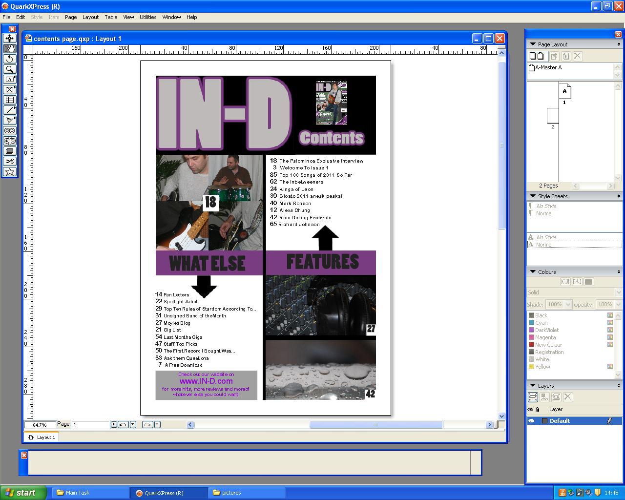
| I had to copy the title of my magazine and edit the word IN-D and change it to contents. I done this to ensure that the colours and style of the effects remained the same. I also added a black box behind the word 'contents so that I could Put it straight into my contentspage as an image on Quark Xpress Passport. |
 |
| Here I have saved the title IN-D as a JPEG file and imported it into Quark XPress using a picture box. |
 |
| Here I have added frames for the layout of contents page using picture boxes filled with a black background colour and I used the word 'Contents' from my first screen grab and imported it as a JPEG into a picture folder. |
 |
| Here I have added my main headings to my title page. The red and black follow my colour scheme and the font follows my production plan |
 |
| Here I have added my content. I used a larger font for the numbers so that they stood out and I also wrote a brief description for my stories and articles. |
 |
| Here I have added my subheadings. I have put these in red so that they stand out. The subheadings also make the contents page easier to follow and understand. |
 |
| Here I have added my editors letter. I have put this in black and white to follow my colour scheme. The letter is fun and suitable for my target audience. |
 |
| Here I have added the images onto my contents page. I imported the images into a picture box which I fitted into the frames that I had earlier made from black lines. |
 |
| Here I have added numbers to the images. I ensured that the images related to the articles with the numbers on and that you could clearly see the number. To do this I added a white box behind each number. |
 |
| Here I changed the layout ofmy contntes page because I felt that my contents page was too 'text heavy'. I used the same images, fonts and colours and simply filmed the layout. |
 |
| Here I put my pictures back in again. I also changed some of my images so that my contents page looked brighter and more interesting. |
 |
| In order to make my images a suitable size I had to resize them on photoshop using cntrl and T and then I had to crop the image using the crop tool above. |
 |
| Here I have added the content back into my piece. I also added more headings so that my contents page looked more easy to read. The layout is much more clear. |

Subscribe to:
Posts (Atom)